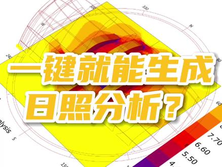
su建筑日照分析图怎么做
这种阴影分析 su 就可以做了,只需要打开 su 文件,将模型样式改为 su 自带的预设风格效应。使用阴影分析 suapp 编号三百一十一后会出现设置参数面板, 调整参数后点击确认就可以生成了, 最后保存到自己的文件夹就成功了。

粉丝10.7万获赞41.9万
相关视频
 02:21查看AI文稿AI文稿
最近学长的微信响个不停,细想学长也没做过什么坏事,再一看原来是不少学弟学妹来找我,好家伙,一瞬间学长都脑补了一个宇宙,结果最后就是问我怎么出日照分析图。 日照分析这种做小区必做的分析图,想当年学长就找了不少工具。有一款插件真是非常非常的好用了,你们不用上,我是真的会删 pu 这两个插件支持 su 时期至二十版本, 插件的安装非常简单,在窗口打开扩展程序管理器安装扩展插件,再次打开 su 就会出现。我们先调整直北针的方向,或者在窗口打开模型信息,修改地理位置风格,模型调整成效应。打开 日照插件,可以修改分辨率日期改到大韩日,时间是八点到十六点,精度在十分钟就差不多了。 later el 分析完成后会保存一张图片,这张图片就是分析后的图,还带了图例。 接下来打开日照动画插件,点第二个图标面板的下方,可以调整时间,然后我们点第三个图标,就会出现一天的日照阴影变化。 这么好用的插件,我不允许你不! 评论区有给大家准备的插件安装包邮,欢迎大家多多点赞评论。 建筑景观线上软件全能班优惠报名中,从竞赛思维到九款软件全方位教学,请进入建筑学长官网或公众号查看咨询哦! 感谢您的观看!欢迎登录我们官网,一个让你不再熬夜的网站。官网提供 su 模型、 ps 素材及案例文本等各类型海量资源,通通免费下载,快进入建筑学长官网体验吧!最后记得关注我们的微信公众号,建筑学长哦!
575建筑学长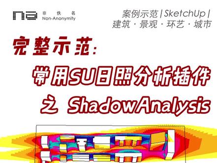 02:04查看AI文稿AI文稿
日照分析的插件和方法有很多,今天我们一起学习用一款入门级的 skytab 日照分析插件 shadow analysis。 首先看一遍完整的操作过程,打开 skyshop, 做好我们要分析的场地素膜,找到阴影分析这个插件,点一下他,注意看提示,请将 su 的样式改为预设样式中的消影, 然后再运行阴影分析。所以我们一定要记得。第一步,右边默认面板,找到样式,选择下拉菜单,找到预设风格,在列表中找到消隐。 第二步,选择一个合适的角度,比方说我们选择一个有透视的,几乎是平面的视角,哎,好看。第三步,点击 阴影分析,在弹出来的对话框中依次设置。首先设置分辨率,就是说这个分析插件最终是要把分析结果自动生成为一张图片啊,这个图片的分辨率我们一般就直接选最大最清晰的就可以了。预定意设置当然是标准 精度,十五分钟,保持默认日期,注意格式,先写日,再写月,中间是点 时间,意思是分析几点到几点点确定,注意看提示,要等一会,耐心的等一会,等到他运行结束之后会弹出来对话框, 让你选择保存路径,你选择点保存就好了,生成好的分析图就在这里了,注意,这个分析插件最终就是生成这样的一张分析图,这张图的角 角度就是第二步,你自己摆好的那个角度,分析的就是你设置的这个日期,以十五分钟间隔为精度, 所有表面的日照时长飞一名软件竞赛作品集班正在报名当中,寒假还有考研复试作品集班系统学习软件竞赛作品集一起来飞一名,嗨起来吧,杯杯。
1826小李要唠唠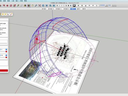 00:31查看AI文稿AI文稿
在 skr 二中,可以使用日照插件进行可触画分析,模拟出太阳在指定时间的运动轨迹, 并可以精确到任意的经纬度和朝向。进行专业日照模拟,观察日照在十二个月中的运动情况, 并为我们的决策提供科学的参考,并可以指定任意月份和某日的预兆可示化情况。
2461优象SketchUp 00:57
00:57 01:25我写了个日照分析插件(通过时间和经纬度自动计算太阳倾斜角度)!#别限制我流量了 #设计 #热门推荐 #设计师 #原创 #设计分享 #建筑设计 #流量 #规划 #室内 #建筑 #环境艺术设计 #日照分析查看AI文稿AI文稿
大家好,我是刘师兄,你还在到处找日照分析的制作方法吗?那么今天分享一款我自己写的日照分析插件,即使你没有参数化基础,也可以一键生成。接下来上教学视频, 在犀牛或者 skr 部当中建好你所需要分析的建筑和地形面,然后在古拉斯 open 当中找到甲乙丙。刘师兄地形分析里面的日照分析插件。接下来简单两步,拾取你所需要的建筑和地形。 在建筑部内部当中点击拾取建筑的部分,把建筑全部拾取到插件里面来。在地形默契当中拾取你所需要分析的地形面。接下来只需要等待三到五秒钟时间,程序会 自动生成你所需要的日照分析图。接下来把布拉梭普给他进行隐藏,那么在溪流里面所得到的就是整个日照分析图,我们再把原有的模型给他全部选中隐藏掉,最后得到的就是日照分析图了, 朋友们觉得怎么样?除了日照分析外,我还写了十八款前期分析插件,包括视线、高层、坡度、坡向等分析图的制作,那么全套插件已经上线,喜欢的朋友私信我,你学会了吗?喜欢就点赞关注一下吧!
388ABC甲乙丙设计学院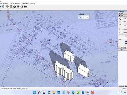 01:17查看AI文稿AI文稿
嗨,大家好,我是邵肖,现在拿到了国宾蜀源的图纸,我想通过 skytop 来看一下他的日照。首先我要找到他的北极, 那我们通过太阳北极进行北极的一个设置,那现在呢已经设置好了,然后我将建筑创建出来,然后现在呢是三月一号,然后我们先设置到上午的八点 东巴区,将阴影开开,那么阴影的朝向呢?是这样子的好,我们可以将它的时间呢调到上午的九点,十点, 十一点,十二点,一点,两点,三点,四点,五点。那通过这 这里简单的阴影来看的话呢,这一栋楼房可能这边的区域在下午的时候应该太阳会晒不太到,但是上午的话没有影响。当然我们可以准确来看的话,成都应该是在东西区,我们可以在这个地方调整一下。 呃,我们将时间呢再往下降一点。呃,可以看到还是会有一定的遮挡,就这边的这个户型。
1803SketchUp少校-筑木筑巢 01:02查看AI文稿AI文稿
感觉自己发现饱了,这个平台居然可以一键生成日照分析动画!不用远见,不用学习,上手就能用!我的天呐,这么神奇吗?首先将场地模型转成阿梅格斯, 然后导入分析平台,单机播放,依照分析动画一键生成哦!就这么简单的!为了让分析更准确,还可以通过地图自定义选择场地所在地区,甚至设置经纬度,以及精确控制分析的年月日。 如果对画面不满意,还可以切换仕途效果,包括显示的分析细节,也可以精确控制是否开启,几乎都是一键操作。不得不说,学院军也没见过这么好用还这么简单的日照分析神器。 别讲那么多了,你快教教我吧!怎么样,喜欢吗?赶紧用起来吧!怎么样,你学会了吗?喜欢就点赞关注一下吧!
1579ABC甲乙丙设计学院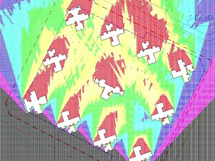 02:28查看AI文稿AI文稿
你真的会做日照分析图吗?他到底分析的是什么?这种图你是不是很常见?还有这张偏地产风格的彩色总平面图到底是如何制作的呢? 哈喽,各位同学们大家好,我是建筑学小帅学长,最近收到私信,日照分析图加上彩色的总平面图不会做,那学长是时候安排一下了,如果你在做规划设计,那你一定要认真听下了。 打开我们的总评面图,我们看到设计院的报规总评图纸还是比较复杂的,可以输入关闭图层 gbtc, 关闭一些我们不想看到的图层,就能清楚的发现我们图纸当中有十一栋建筑。 在学长上大学的时候,经常干一件偷懒的事情,那就是用拷贝版临摹图纸,省事省心不费力,效果杠杠的。哎,同学,你做过同样的事情吗?为了能得到建筑的外轮廓线,我们也可以在天正当中创建一个底图的拷贝版,相当于你那张要 名额的图纸。随便画一根线,选择中输入 b 乘块,右键在位编辑。进入块当中进行编辑,我们可以发现总图已经变成了一个虚无的状态,很好。输入 pl 多断线命令,慢慢勾勒出建筑的外轮廓线。 大家注意,线一定要是一个闭合的状态,相同的块 co 直接复制就可以了。我们可以通过这种方式把所有建筑的外楞波线都找出来,将绘制好的建筑移动出来一定的距离,保存,参照编辑会出到原始的状态。当然,图框建筑红线、汇聚线也复制到一个合适的位置。 找到天正菜单栏里的建筑高度,选中所有的建筑,输入你自己设计的建筑高度,如果地面是平的,底标高设置为零。当然如果你有类似的地形高差,就按照实际的来定哦。我们可以安 shift 键加鼠标中页,发现我们所有的建筑都已经有高度了。找到多点分析,再次框选所有的建筑,会出现一个选项卡,这里找到当地的日照管理条例,输入进去一个正确的数据,计算高度就是一层的窗台高度,点击确定 就会出现类似的一张日照分析图了,我们就会发现建筑与建筑之间会造成日照的遮挡,那么返回去再看一下是否符合光照超过两小时的规范,如果没有,那么这个建筑就不应该涉及到这个位置, 这下你明白了吗?作为规划设计当中最基本的日照分析图,希望你能从本期视频当中学到更多的软件知识以及设计的知识。接下来我们来制作这张偏地产风格的彩色总评编图,你准备好了吗?想不想再学习一下呢?我是建筑学小帅学长,我们下期再见!
2662小帅学长的软件小课堂 03:40查看AI文稿AI文稿
如何三分钟画出一张精致流线分析图?在线工具膜带云将是你的最佳选择。 让我们从一个复杂的图书馆模型开始。模大云支持 sketchup 模型直接导入,但请注意不要存在碎面、断线和重面。提前炸开你的模型,拉开各层间适当的距离, 充分利用图层区分材质将有利于之后的绘制。点击搜索膜带云,开启神奇之旅。 模型上传后,短暂的转换就可以开始编辑。素模风在内的多种显示模式可供选择。自然 l 效果摆脱渲染器的智骨环境调节参数丰富,也可以 变化视野范围。轴测在内的多种仕途模式随你选择。让我们先对部分组建描边,区分图面层次 可以根据组件、材质与图层三种方式选取希望操作的部分,按住 control 便可同时选中多个组件 组建,选中之后也可以为其上色。预售色板可满足大部分需求,也支持手动微调。 对于流线分析图中重要的楼梯赋予醒目的颜色环境,在稍微复色便已经是一张非常漂亮的轴测图了。绘制镜头前先选好一个合适的尺寸, 绘制中的箭头支持正交锁定和绘制平面锁定,绘制中可以切换平面绘制三维箭头,单击下方完成按钮,我们便完成了一个箭头 进入时,取模式可以使用操作者进行微调,箭头的颜色、粗细、方向均可修改。调节时取模式下可以复制删除箭头,同样支持批量操作。绘制的箭头将与建筑模型具有真实的遮挡关系。 接下来让我们完成剩下的箭头绘制。 坡道连接的上下交通,我们就换一种颜色吧。 调节参数箭头也可以成为辅助虚线, 当切换到轴测试图便是一张完美的流线分析图了。点击最下方截图获取高清图像。 除绘制箭头外,莫大云支持使用 po 切和 po 切模型,后面图导出时记得勾选隐藏 po 切框,做出一张带有流线的 po 轴侧,同样易如反掌。 支持多种滤镜风格,小清新、档案黑酷炫应有尽有。 精致的分析图,高效的云工具,十分钟完成,一切都在膜带云!
265模袋云-建筑分析图神器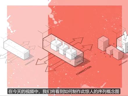 12:57查看AI文稿AI文稿
today's video we're gonna see how this amazing sequence concept diagram was made quick note if you'd like to get the files from the video and do it together make sure to check our gum road page links on the description or in the video cards all right let's jump right into it first step is over sketchup here just make sure you have the parallel projection activated then click on the iso view to have a perfect isometric if you can find this option here right click it on the stab and activate view finally sport this image as a pdf, so we can work with vector based shapes now into illustrator so this step is essential to clean up the file and prep it to the photoshop part so first, let's adjust the canvas size we're going to use it in pixels so if yours isn't in pixel just hit ctrl r and then right click on the ruler and change it to pixels let's use nineteen twenty by ten eighty it's the sixteen by nine proportions next skill the objects then with everything selected hit d to reset to default all the attributes this will turn it black and white and with an even stroke next to fix the corners mark this options right here on the stroke window and then let's make groups of each part of the sequence and using the align window align them from the bottom and place them even distance from each other finally make sure to save it as a ai file, which is a standard illustrator file now the photoshop part you know this sequence diagram could be done all in illustrator which is my tool of choice for these type of diagrams, but since the major part of you guys use more photoshop than anything else i decided to do it differently all right we're going to create a new file with sixteen by nine and here comes a special trick you must place the ai file using the place linked option so that whenever will make a change over illustrator it will automatically update over photoshop then here on the crop to make sure to use the media box so it will maintain the proportions that we used over illustrator i'm going to remove the few from the objects only the straighter and hit save then now it's a very personal step we just got to draw the arrows that you saw on the final image you can do this yourself where you can find something from the internet and important to use for example you can go to a website call flat icon com or something similar to download already cheers ever icon once you're ready copy from illustrator and baste it as pixels over photoshop let's use the boxes from the middle as a reference to place the connection arrows now transform the arrows into an isomatic perspective follow my steps to make it the same way we just need to change the skew and rotation using thirty degrees if you'd like to know more about this process i'm going to leave a note video that i did talking like a bit about this process both an illustrator and photoshop good now let's make it into a group create a new layer on top and clip it below using the shortcut control alt g in this layer let's paint some white to fit the arrow where it is inside the first box now on the next drawing let's place the arrows on top make it into a group as well to organize your file and then color coded next we can copy the end of both sides from the force drawing to simulate the side buildings that's what we're trying to communicate the connection between both sides of the building letters into making into three volumes then each volume will have a specific kite to relate to the entourage finally on the last drawing, we're gonna choose the scale figure spec that i did to show how tall the buildings are and how the space is going to be used if you'd like to get a copy of this pack, i'll leave the link on the description and over the cards as well now, it is time to add some text when doing diagrams like this i really like to use texts in the isometric position as you can see i mispelled the connection, but you got the idea all right our base is done now we can move on to the extra details to add shadows simply exported from sketchup as a png scale it and place it correctly a cool effect that we can add is an overall contour to the sequence you could import it from illustrated if you'd like to, but with a simple brush you can do it over photoshop pretty good enough you know the key to make a great complex position or even design a pleasing board is to have a color scheme a color palette there are many places to get them, but for example there's one from adobe you're going to see that i actually didn't use it much, but it's good to have on your file usually a good trice of complementary colors an interesting use of different strokes or contour with make half of how well design your diagram will look alright, since we remove the background from the object we can place the paint underneath the concept diagram layer as you guys will be able to see this process now isn't linear you gotta test out all the possibilities to see what looks good and what doesn't using the filter add noise you can give some texture to this background i really love this effect it looks really good already but if you've been following our videos for time now you know i like to use these watercolor and splatter brushes to give some more texture to the image this very last step is all about composing and balancing the elements i hope you enjoyed and learned something from this video leave in the comments any questions or thoughts over this process like it to support us and subscribe to the channel if you haven't already i post videos weekly in all sorts of visualization follow us at ow graphics on instagram to see the extras and get the first updates thank you so much for watching and if you watch it until here let me reward one review for that here's one coupon of a hundred percent discount over the scale figure spec get it fast before the others all right for me this is it as always i'll see you on the next video bye。
22老燊


