blender.图像纹理,怎么分层
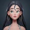
大家好,我是吕老师,今天这节课我们继续来制作瞳孔这里的纹理效果啊。首先我们先来看一下瞳孔这里的这个效果, 我们把外层的这个模型给他隐藏掉,看到这个里面的瞳孔模型呢,他的面数还不是很高啊,所以说精度也很差。我们这里呢就需要给他去增加一个这个修改器,增加一个多级精度的修改器,然后呢给他添加两级细分,这样的话呢最终的这个效果看起来呢就会比较好一些啊。接下来我们再来看一下他的这个色彩变化 啊,首先我们先按 ctrl 键加 shift 键,然后在这个色彩渐变这个地方颜色渐变这个地方单击一下啊,现在所要做的第一步呢是把他的这个颜色渐变的给他调出来,之前呢我们只是把中间这里呢给他调黑了,但是呢实际上作为瞳孔来说,他的这个黑色部分到外围的这个地方,他还是有一定的这个渐变效果 好,下面我们给他多增加几个这个控制点,给他去调一下啊。外围呢其实也是需要稍微再深一点点的, 再再过来一些, 这里面呢黑色的部分过来有一点点渐变,然后这边呢要稍微再薄一些,这个地方还需要再加一个, 这个可以再稍微深一点点 啊,略微有这样的一个这种渐变效果就可以了,色彩部分呢就调节到这里。 好,接下来呢我们就利用之前外围的这个眼球,它上面的一些纹理呢来进行这个制作,稍微节省点时间。我们看一下啊,可能是要求用这上面的这种纹理程序纹理来进行制作,首先我们把这一段给他复制过去好了,选择这一块的这个纹理给他按 ctrl 加 c 拷贝一下,然后呢再到瞳孔这边来给它按 ctrl 键加 v, 好在下面了 多复制了一份,而一些这种杂乱的这种点呢,都把它转折点都给它选的住,给它删掉去, 好,这里再移上去,这边呢给他移的远一点,好,下面我们首先先来看一下这个纹理他上去以后是一个什么样的效果,然后我们选择这两个节点,把它按下 m 键,把它先暂时 这个关掉它的显示,那作为中间瞳孔来说,它这个地方的条纹状这个效果呢应该是比较密的才行啊,所以说这里呢我们需要再给它调节一下缩放,就把这里的这个密度啊调的比较这个强才行,这是一个,还有一个需要把它的拉丝状再调的再明显一些, 好,就把这两个值再做一定的这个调节就差不多,然后稍微对比度什么的看上去再明显一些啊,这样子 就 ok。 那这个条纹状的这个纹理制作好了以后,我们还需要给他增加一些细节上去啊,我们还是把原来的这一套节点呢给他复制一份,是不是加 d 选择住他们,然后呢把他们的这两个节点给他打开, 就这个效果给它打开,然后再在这个上面呢去做一下调节,现在这个呢肯定是扭曲的太厉害了。还有一个这个纹理呢,肯定也是太密集了,这里呢我们都需要去 调整一下,把它这个缩放给它降低,这边也是一样,拉伸也稍微减弱一点点。好,这里呢再把这两个节点给它打开,按一下 m 键,打开了以后,这个系数给它降低一点点,这里的缩放也都给它稍微调的少一点点, 总之呢就是有一点点大块的这种扭曲变化效果,像这样子类似。好,然后呢我们再把这个效果呢给他跟这个上面的这个条纹状给他去做叠加。好,我们给他按空间加 a, 输入混合 rgb 这个节点输进来以后,然后我们把他俩呢去做一下这个色彩上的这个连接,连接好了以后我们再来给他去进行一个这个,呃,观察效果叠加方式呢,就还是这种混合好了,然后把这个滑条稍微调一下,看一下效果, 上面色彩这个位置颠倒一下也差不多。可以啊,把这个系数呢再稍微开低一点点, 让他俩的稍微比较能够融合在一起就比较 ok 了。再往下呢我们给他做一点点这种环状的起伏效果,也还是用这个这套节点啊,复制一份,下面这个就可以给他删掉去。 好,先观察它的效果,然后把这里的类型映射类型把它改成这种点状就行了。改成点状以后,这个现在环绕的太密集了,把它这个数量减少,这是一个,然后这个也给它降低 啊,类似这种感觉,环绕的感觉就 ok。 然后再看一下这边的这个 照播的效果,这里呢需要再给他减弱一点点,可以略微加一点点,零点零一五。 好,这样子的话这个效果也就有了。好,再往下呢就是把这个纹理啊,把它跟上面的纹理呢去做叠加,我们给它这个复制一份过来,然后把它的颜色 连接过来,先先看一下效果 啊,连接上去以后呢,他是整个纹理其实呃都已经印上去了,是比较均匀的像印上去,但是我们可以通过这个呃系数这个花茶来进行调节,对吧?开到一的话就全部出来,开到零的话就全部没有,但是呢我们想让让他 那是在中心这里呢就弱一点点啊,然后呢在外围呢就比较强一些,那这样的话呢这个系数这个地方其实就需要有一个这个黑白图来去进行控制,那我们就使用这一套节点生成黑白图来进行控制 好,把它这里的颜色呢都给它重新的归下位,我们选择这个节点颜色界面节点按一下回格键啊,这样的话呢就可以去进行一个调整,我们把它的这个方向给它反一下,大概在这个地方为止,让它没有可以看一下它的线框, 差不多从这里开始渐变过来吧。 好,大家支持这样的一个渐变效果了,然后我们就可以把这张图呢去给他连接到 他的细数这个地方,就这我们把它脱下来,这样的话呢其实这个地方他就会有这种渐变了颜色过来到细数这啊,这样子就实现了我们想要的这种效果,在周边有这个波浪状的这种感觉,这样其中间呢又没有 好。再往下的话呢,我们来做瞳孔这个比较中心的这一圈啊,比较密集的,然后呢边缘又有这种凸起的这种效果啊,我们可以放大看一下,就这种 尽量用这个程序纹理呢给他模拟出来,那首先我们需要做出他这种边缘不规则的这种效果,然后呢再往上面去叠加上更加细致的这种纹理, 就显示出他和现在的这个纹理呢又不一样。好,现在呢我们把之前的这一套纹理 给他选择注,再复制一份出来,好, shift 加 d, 好,复制出来一份以后,我们再给他添加一个运算节点, 添加出来以后我们再把他们的这个颜色呢都给他连接上去,连接到这个运算节点上,再来看一下他的效果,这里呢我们给他改成这种相减, 那我们想要的其实就是类似这种的这种黑白图,但是呢这个密度啊,这个 发散装的效果呢,还需要进行调节一下,现在的这个密度呢都有点大了感觉,然后拉扯的太厉害了,这些需要调整一下, 然后这个地方我们也需要把这个颜色界面节点呢用于这个调整它的效果,所以说这一套呢,我们还需要再给它去进行复制一份下来, 来取代原有的这一个啊,这样的话呢这里调节就不会影响到上面的效果,我们再调一下这里,把它缩回去一点点,因为这个地方的范围其实还是比较小的 啊,这个密度总感觉还是大了点, 这样子差不多了看上去啊,然后我们在需要在他前面去给他增加一个颜色节点连接到系数,这啊再看这里再来给他进行 调整,把它恢复到原来的样子,按一下回格键,然后通过颜色的调节,把这个图呢就变成这种比较纯的这种黑白图的效果,然后再给他等一下叠加上这种细致的纹理上去就差不多了,这个范围如果想缩小的话,其实还可以再缩一下看一下,现在其实稍微有一点点大, 哎,这样子差不多了,刚好大于这个中心的这个黑色瞳孔的这个范围就行了。 接下来呢我们就通过叠加的这些节点呢,来把它这里的效果给它叠加上去啊。我们首先还是先把之前的这个比较密集的这个纹理呢,这套节点给它 shift 加 d 给它复制一份,复制一份以后其实还可以再把它调的密一点点啊,主要是要跟这边呢要有所区别, 好把这里呢再调的大一些,这里拉扯也再狠一点 好。然后呢我们再把这个 r g b 混合的这个节点复制一份,好复制一份以后,那我们现在来看,我们现在这黑白图呢,要给它连接到这个系数这个地方 啊,其实就是作为一张通道图了啊,然后再把下面的这一个密集纹理给他连接到色彩一,然后 这个就相当于提出来了,提出来以后再把这个作为这个底给他加上去,然后我们再来看这样的话,这个中心其实就已经是可以了,就有了这个叠加上去一层的比较锐利的这种边缘 这种效果,而且里面呢又比较密啊,那这里的这个纹理效果呢,其实就已经差不多了,然后再往下我们就是把它的这个颜色呢给它叠加上去 啊,基础的这个方向纹理制作好了以后,我们就可以把颜色呢给它叠加上去,我们看下颜色,颜色是这样的一个渐变效果,可能稍微有点暗,等一下还要再看整体的效果啊。现在的话我们把这一个 这个又跑出来了,好,把这个混合 rgb 再复制一份,复制一份以后把这个颜色给他拖过来, 好,这边这一个纹理给他拖到色彩二,然后再来看一下他们的效果,这里给他改成叠加啊,这样的话就直接有这个纹理的这个效果,又有颜色变化,又有这个方向性的这个纹理了,整体的效果就还不错。然后我们再把外围的这一个颜 球效果给他打开,打开了以后再来看看这里的这个效果,其实里面的话就现在来看就稍微有点暗,需要整体的去给他加亮一点点。好,现在我们选择做瞳孔这个模型,然后把它这个颜色渐变的这个节点,这里的颜色呢都给他稍微调一下, 稍微给他调的亮一点点给他,不然的话整体显得就太黑, 包括里面这个里面这个就不需要调太亮啊,中间的这些要调亮一些了 啊,大致是这样的一个渐变,再看整体的效果, 这里其实可以把它连接到这个基础颜色这个地方,再看整个,其实后面还需要再给它添加这个,嗯,凹凸效果上去现在还是有点太暗, 然后我们现在再来观察一下,会发现这个地方颜色而且还有一些偏红,所以说这个色彩呢,也都需要再调一下,让他们不需要变得那么的偏红,饱和度也什么的也都低一点点, 偏稍微黄亮一点点, 好类似这样的一个效果,然后我们再把整体给它显示出来再看一下, 好了,到此为止呢,这个纹理效果呢就已经是做的差不多了,下节课呢我们把整体的凹凸效果呢再调节一下,然后呢在其他的效果上再稍微细微的调整一下就 ok 了。好吧,那今天这节课呢就讲到这里,谢谢大家观看,拜拜。 大家好,我是吕老师。今天这节课我们继续来稍微细调下这个眼球的效果啊,之前的话我们是用程序纹理把它表面的这个色彩纹理呢给它模拟了一下,现在呢我们再把它的凹凸效果给他制作一下, 这里呢只主要是还是想把他的表面的细微的血管起伏给他模拟一下。其实我们可以直接用他的这张色彩图就这个来去进行一个模拟,我们把原有的这里的一个颜色渐变的节点给他袖子加底复制一份,复制一份以后, 好直接再把这里的色彩这张图可以直接拖出一条线到这个颜色渐变的系数,这我们再来看一下,然后呢再把这个颜色渐变的这个节点呢给他重置一下,按一下这个回格键 啊,这样的话就得到一张这个比较好的黑白图。得到这个比较好的黑白图以后,我们接下来去新建一个凹凸节点, 好新建出来以后,把这个颜色渐变的颜色这里呢直接给它输出到高度这个地方,然后我们到这里来看一下, 好,稍等一下,好,这样的话呢就可以看到他的表面的起伏的效果,我们可以通过这里的强度力度呢来去进行一个调节,让他不需要那么的强,然后看一下他的这个起伏是否正确 啊,点击下反转再看一下啊,这样子的效果呢就比较接近一点点,但是这个力度强度肯定是太过于强烈了,只是需要他微微的有一点点这种起伏,那像这样子的一点点细丝状的起伏效果就 ok 了 啊,这个效果可以了,以后我们再把凹凸节点的这个法像这里呢,直接拖动到他的这个材质球的这个法像这个地方就行了,我们再来去进行一个这个观察,那这样子就有这个血管血丝的这个轻微的起伏凸起的效果啊,这个表面的这个玻璃体眼球的效果呢就已经是 ok。 好,接下来我们再来调节一下里面的这一块的效果,好把表面的这个 模型给它隐藏掉。那对于里面的这块的效果的话,主要是我们开启了这个呃,玻璃 色,那么会感觉中间这块呢大起来了,所以说我们需要再给他调节一下,让他中间瞳孔的这一个啊发散状的这个效果呢,再稍微往里去进行收缩一点点就把他的范围呢再减小一点就行了,我们要把这个给他开起来去看去调, 不然的话呢他这个控制这个效果的就标准就不一样了,看一下是在哪个地方啊?是在这个地方,那这里呢,我们需要把这一块这个效果呢去给他再向里去收缩,你看开起来和没开起来的这个差别所以说还是大了,这个地方 把它开起来好了,看一下是通过哪个来进行控制啊?是用这个颜色渐变节点来去进行控制,让他稍微再小一点点, 好,再看一下这个整体的效果,这个地方 好,这样子看上去呢就感觉上是差不多了。好,再往下我们需要把中间的这个发散状的这个颜色,就他的这个底色颜色,再把它稍微调的深一点,根据他的这个造型来调啊,我们现在呢把这个这一片的这个节点 给它去进行这个复制一份 shift 加 d, 好,复制完成以后把它拖出来,拖到上面去, 然后再把这个色彩这一块也给他拖过来啊,主要是要把他们俩呢去做一个这个融合,我们这里使用这个混合 i g b, 然后这 混合呢需要混合两次,因为这个呢是拿来作为这个底色,然后这边呢还需要再把他们呢去进行复制一份,然后呢这个呢拿来作为这个啊透过来的这个颜色,就这个颜色 来去进行一个叠加,然后我们把它的这个颜色呢稍微给他重置一下,重置一下以后再来去做一个连接 好下面的黑白图,这个这一串节点的颜色输出到细数这个地方,然后呢下面这个颜色渐变这个呢给他输出到色彩这里,然后再来去进行调节,那这里的颜色其实跟这边的颜色就差不了太多,我们稍微可以用吸管看一下, 或者自己手动的去调一个也行。 so do 调一个好了,稍微需要深一点的颜色,这边这个你就直接把它剪掉就行了。然后我们再来看这里的这个颜色效果。好,现在这个没什么变化,我们把这个滑条给他调过来, 主要是这里,然后再给他增加一个,让他有点这个颜色变化好了渐变的效果,这样好,我们再到这来这里其实最好要给他调出一点渐变效果,就这样的话就比较细微细致了, 这个要比较深了,再过来一些,好,再到这边看,略微有一点点吧,没有那么的明显,因为他本身 这个范围比较小。哎,这样子就有了一点好,有了这个效果以后,我们再把这一层 就原本的这个色彩层这里呢去给他做一个叠加,叠加在他的这个色彩二上面,这样的话呢他就能够覆盖上去,覆盖上去以后我们就可以看得出来啊,他其实这个地方范围是小了,但是这个色彩呢就还是浅了,所以说这里呢需要再给他加深,像这些地方的颜色 饱和度也稍微加高一点点。 好,那这样的话一个这个色彩的这个变化呢就已经是可以了。 好,然后我们把新完成的这个颜色呢给他直接连接到他的这个色彩这啊这里还要再跟他这里去做个叠加看一下 啊,毕竟还要跟原来的这个纹理去做一个叠加。 好,是这个样子,然后我们再把外面的眼球给它打开,好,这么看呢稍微有一点点暗,有一点点暗, 那我们就把这里的颜色呢再稍微提的高一点点 啊,稍微提的亮一点点啊,后续再看 好,再往下呢,我们就需要把它做出它的凹凸效果,凹凸效果呢主要也是使用这个之前的这个做好的这个纹理啊,来去进行这个模拟,但是呢还是想给他做一点点这种不同的变化效果,因为现在他们的这个明暗强度呢,都差不多凹凸起来,这个效果呢 其实也都是大家都差不多,所以说呢,需要把边上这里呢给它稍微在这个呃改变下颜色,给它加加白啊,所以说我们这一连串的这个节点啊,就需要给它去复制一份了。 好,就这一串啊,因为这一串呢刚好是这个黑白的这个完全的展现了这个效果。好,我们把这里呢给它去进行一个 shift 加 d 复制一份往下移, 好,这个地方再来看一点点去调。我们通过这个部分节点的这个观察,其实主要是看到在这里呢就是这一块需要去给他稍微调整一下,那我们这里去给他比如说这里复制这一串节点下来, 好,然后呢通过这里的叠加去给他调整,这里呢给他恢复成原状。 好,这两者呢我们一个是给他连接到色彩一,还有个连接到色彩二啊,然后再从这边去看一下啊,差不多想让他有这种比较灰白的这种效果就可以了。然后再把这个呢去给他这里去做连接看一下, 这个地方就直接是连接到色彩二这里。好, 再看啊,就中间这里呢就比较明显,周边呢就稍微弱一点点啊,主要是想要这样的一个效果,然后这一大串呢再拿来作为这个凹凸效果去给他连接到他的凹凸的这个通道上面就可以了啊,我们接下来好直接给他生成一个 凹凸接点,好,把这个颜色呢直接输出到高度这个地方看一下, 现在这个强度应该会很强。好,我们现在把这个强度力度给他减弱啊,那显现的出这个锯齿状,他还是有个边缘的这种效果就让他们还是要有一定的这种差别才行。翻转看一下效果, 我看一下哪个合适,这个的话就是这一圈凸起,那这么看起来还是,呃,不开启这个反转稍微正常一点点。好,然后我们再来 把这个凹凸呢直接连接过去, 反向直接连接到。 好,稍等一下 啊,这样的话我们再来看这个地方的这个效果,就已经有了这个凹凸效果,但是可能还需比较强,还需要再稍微弱一些这个地方。哦,然后我们再把整个的这个效果给他打开啊,这样子就可以看得出他的这个调温状的这种感觉我还是有点强。 好,最后我们再来看一下它的这个色彩,这个地方 好想让他这个中间呢完全变得比较黑,或者说是再死黑一点的这种效果,就这个地方 完全的把它脱下来好了。 好,再看一下整体效果,还需要加上这个外面的眼球透明玻璃体。好,稍等一下, 好,这样子的其实就差不多了。好,最后我们再把它的这个色彩,就是边缘瞳孔的这个边缘这个地方再给它稍微加暗点,要有一圈这个暗色调的这个一圈颜色。好,这个应该主要是在这个上面去进行调整,看一下, 就这个位置啊,他要再进来一点啊,所以他俩的这个范围呢,要再调整一下这个呢,再把它拖进来一点,这个也一样, 这个深的这个颜色节点,再把它往里走,就记得一定要开,把这个外面这一层的给它开起来,这样才这个效果,才外观效果上才算是正常一点,感觉 好,再把这个颜色稍微弄浅一点,现在有点太深, 再稍微浅一点, 抢过头了。 啊,这样子呢?就差不多这种,至少现在这个渐变啊,颜色渐变就可以了,比较有层次啊。我们再把整体把它弄上去看一下啊。 好了,那今天这节课呢,就讲到这里,主要讲解了这个眼球的整体的细节的效果调节。好,谢谢大家观看,拜拜。
粉丝1.6万获赞15.6万
相关视频
 01:34
01:34 02:05查看AI文稿AI文稿
给大家推荐两个超级方便的插件,这个插件可以直接在你的这个节点里面,然后导出 exr 文件,然后呢你可以快速的将这个文件导入到 ps 里面来,点击这个默认的打开就可以了, 我们可以看到的是下面有非常非常多的分层图片,那么你就可以在 ps 里面对他进行一个分层的单独调整,那我们现在来看一下是如何制作的吧。 首先你需要在 gethop 上面去下载一个 exr 插件,这个插件呢下载完成之后呢你会获得一个压缩包,把它解压之后你就会获得这些文件,之后你在这个 bland 里面的编辑编号设置,点击安装, 安装之后安装这些文件。安装完插件之后呢打开这个插件,如果你找不到的话,那么你可以在这里搜索 ex 二,然后安 装这个插件。安装完成之后呢,我们可以到这上面的合成节点这里来,就是这边的这个合成节点,点击这个使用节点,然后刚开始这里是会没有任何节点的,我们需要在右边找到这个视图层属性,那么下面呢就会有灯光以及这个分层渲染的这些需要导出的资源。 那么具体的使用方式可以观看 b 站其他大佬的视频教程,或者我后期也会出一套教程。 然后呢我们找到我们刚刚安装的插件,直接点击一下这个 exr 自动,那么他就会自动把这些节点全部都连接好了,然后你点击这边这个文件,这个打开意思就是说这个 exr 文件会保存在哪一个目录里面, 然后直接按 f 一十二对他进行一个渲染,好,这边就已经渲染完成了,炫完成之后呢你就可以直接把这个文件找, 那么这个时候如果你需要把它导入到 ps 里面的话,推荐给大家这一款插件,这个插件你直接点击这个下载,然后呢在这里对他进行一个简单的安装,之后呢我们再重启 ps 之后呢,再把这个 ex 二文件直接拖到 ps 里面来,点击这个默认的打开,那么呢你就可以在这下面呢对他进行一个分层的调整呢,十分的方便。
 03:32查看AI文稿AI文稿
如何在 band 里制作水面动画视频?最后帮大家梳理了重点知识,记得点赞收藏呦。当我们想在 band 里面呢制作这样的水面,其实方式方法有很多啊,那么这回呢,我们来研究一下用置换怎么来制 制作啊?使用置换来制作水面的话呢,我们可以先建一个平面,在这里面呢,我们可以按鼠标右键进行细分,细分的时候呢,分段数呢,适当的可以给高一点,比如给到三十就好了,给了以后的话呢,我们这个时候在修改器当中哈,然后呢我们找到置换, 在这边的话呢,可以看到他有一个置换修改器就是变形了,为这个模型的话呢,我们新建一个纹理,那么置换呢,是通过纹理的黑白变换来确定模型的高低。我们在纹理当中呢选择允许效果,在这边允许效果当中的话呢,你可以看到有很多的变化,比如说我们改为一道犀利,另外呢可以去改下这种尺寸,通过 修改器的面板的话呢,我们还可以控制一下它的高度,你也可以选择不同的计算方式,以产生不同的这种水面波纹。那打一个比方哈,我们就使用这种哎原声的这种系统好了,在这种原声系统当中的话呢,哎,我们就可以轻松的看到这边波浪的这个起伏, 如果你希望获得更细腻的效果的话呢,那么在之前细分的时候,细分到更多的段数,就可以得到更细腻的这种波浪的这种纹路。那么然后呢在这边的造波类型里面呢,哎,也选择一种更贴近于水面的造波就好,然后再调好造波大小之后我们怎么样让这个水面的波纹动起来呢? 我们可以在这里呢添加一个空对象,我们让这个噪波的坐标和我们的物体的挂钩,那么这个时候呢它的大小会发生变化,那么我们可以在尺寸里面呢重新的调一下这个噪波,让他的这个尺寸呢?哎,和我们的这个之前的调好的效果相匹配。我们现在呢只需要在 这里移动空对象,我们就可以看到这种水面的波纹的变化,我们打开关键针模式,然后呢在这里移动我们的空对象,接下来呢比如说我们到一百针的时候呢,再将这个空对象呢?哎在这里面移过来,这样的话呢就能够形成水面波纹的这种滚 动的动画。那如果我希望动画持续该如何解决呢?我们可以进入动画曲线的状态,按下微键将曲线变为适量,在这个动画的轨迹上面的话呢,将它的外延模式变为线性外插,那么这样不论我的动画有多长,哪怕超出关键针的部分,动画也会延续运动, 你也可以在这里呢为他分配一个材质节点,切换到我们的这个显示状态下,我们在这里可以给一个这样的水面的这个材质,可以将他的粗糙度哎降下来。另外呢可以将他的这个后摄和我们的阿尔法通道开起来,为了能看到我们的效果的话呢,我还可以在这里 再去添加一个圆柱材质的属性,当中要把混合模式变为阿尔法混合,我们才能够看到这种阿尔法混合以后的效果,屏幕空间的折射呢也是可以把它开起来的。如果我们现在播放动画, 其实就已经可以看到水面的这种动画了,但是如果你想增加更多的细节呢?哎,我们可以再加一遍,就是在他的材质属性当中再次的添加一个纹理, 我们可以添加一个噪波,然后呢将这个噪波呢去进行一个适量的转换,我们转换成凹凸贴图,并且将这个噪波的系数呢挂到我们的这个高度上面,然后呢将发线呢哎连接上来,在这个水面的这种表面呢,哎可以形成一层更细节的这个躁动的效果, 我们可以在这里面呢去增加这个噪波的细节,另外呢可以控制这个噪波的缩放以及我们的强度,那这个时候水面呢会有更多的细节的变化。此外呢如果按 ctrl 键加 t, 我们也可以为 为这个造播的话呢再添加一层动画也是没有问题的。
981浩克肥虫 03:12查看AI文稿AI文稿
文理汇,这个顶点汇是有一定的区别,但又是很像的,我们随便新建一个圆管吧。 ok, 我们在这里有一个圆管,我们直接回到我们的一个 纹理绘制,怎么是粉色呢?又很萌是不是?对于新手来说怎么是这样呢?是不是擦东西啊? ok, 他其实在这里我们把滑轮往下滑,滑到最后面有个纹理槽,按本在 blad 里面,你们看到是紫色的,就证明他缺贴图,对,他缺贴图。 ok, 我们这里面有分两种材质和单张图像,材质就是你要新建的材质,单张图像就是你自己做了一张图,把它贴上来,或者找了一张图。 ok, 我们这里面有个加号 看没有,然后这里面没有纹理,看没有,他就提示你没有纹理,这个加号看没有。这就是我们 ppr 里面一套流程新建基础。 ok, 这里面有一个宽度,高度就是你的尺寸,然后颜色你都可以改,包括命名。 ok, 我确定 回到我们的一个材质,在这里面有一个材质,看到没有?他就在材质里面跟你新建的一个材质节点。 ok, 我们同样回到我们的玻璃绘制,这个时候你就可以在这里面去绘制了, 比如我们调的青色,哎。 ok, 这不就非常棒吗?他是不是又像那个顶点绘制了,你就可以去绘制你想要的颜色了,绘制好了之后他和顶点颜色不一样,他好就好在他可以直接到渲染模式去看,看到没有,现在没有光是因为没有 hdr, 我给一个 hdr 天空的 hdr 找一个,找一个 brand 自带的吧, 找一个不良的姿态的。 ok, 这是在 ev 的渲染下去设置一下环境光遮蔽,运动模糊以及色彩管理,把它电影化调到超高对比, ok, 或者是高度对比都可以, ok, 现在就好很多了,分了一个七百米散色,给他一点七百米散色,我们找到一个颜色去混,他都可以看到没有, 然后我们把次表面的颜色开一下,强度看到没有,你都可以达到你想要的一个颜色贴图的感觉,当然纹理绘制里面还有一个选项,然后我们同样在这里面,我还是想让他亮一些啊,我们同样这边曲线变亮 一些,对比变强一些, ok, 单张图像,单张图像是什么呢?比如我们打开了这个照,然后打开了这个单张图像,要打开一张图,这个时候我们就需要去找一张图回到我们的桌面, 比如说我找一张随便找一张图,就找我这个 logo 吧, ok, 把这个 logo 贴进来,哎,贴进来怎么没有了?你是不是很萌?这时候我们因为我们现在连的还是刚才画的这张图,是不是我们现在需要把我们刚才找的这张图把它贴进来, ok, 贴进来, ok, 它变形了,原因是因为现在没有展 uv, 回到 uv 模式, ok, 选择它,然后全部 uv, 然后智能 uv 头饰, ok, 看到没有?他现在因为是用智能 uv 头饰就很乱,我们自随便自己跟他展一下吧。到我们的边模式,选中我们下面的这个边,然后再找到我们侧后面的这条边,然后再找到我们的里面的这条, ok, 然后标记缝合边,然后 a u 展开已经贴上来,贴上来,然后我们再回到我们的一个 u 编辑器,选择它,这个时候我们就可以去缩小和放大,比如说你想象力的 logo 出现在哪个位置,那我们就去移动这个位置,那就已经有了,看到没有?太多了。 ok, 看见没有你这个上面就已经有了你的 logo 不同的一个贴图形式,然后在这个位置也是一样。比如我们回到文例模式,在文例模式这里面同样 在这个位置,这个小扳手这里和这个上面是一模一样的,和这个上面是一模一样的,看见没有也是在这里去,也是在这里新建。 ok, 这就是纹理绘制和顶顶绘制的一个区别,下节课我们来讲一下权重绘制。
338设计师方潘 00:17查看AI文稿AI文稿
分享一个 blender 最新插件模型分层单独渲染工具 render tools, 它可以快速选择要单独渲染的一个或多个对象,然后按渲染蒙版通道获得选定对象的最终渲染,并在最终图像中合成透明度。这也类似于我们在 corona 和 pro 中发现的快速渲染蒙版对象来修复问题或更新最终图像,无需再次渲染整个图像。
178武汉蓝鲸科技 00:17查看AI文稿AI文稿
无论您是要增强微妙的高光混合颜色,还是制作复杂的图案, philogic p b r painter 插件都能帮您实现。它可以对贴图进行分层处理,也可以直接在图层上进行贴图绘制。并且 philogic p b r painter 也简化了您的纹理处理过程,同时还支持智能材质,所以也可以根据自己的需求对他们进行调整。
327武汉蓝鲸科技 06:39查看AI文稿AI文稿
大家好,我是设计师老克,最近我在学习 baranda 的文理绘制功能,现学现用,在这里我做个小教程分享给大家。我使用的是 banana 二点九一版本。首先我们点击小键盘上的数字三,进入正焦幼师图,拖进来一张减脂牛的图片作为参考。 点击 g 键可以移动图片到中心的位置,点击 s 键放大一点, shift 加 a, 新建一个立方体。点击 g 键移动立方体到牛头的位置,按 z 键进入限宽显示,按 type 键进入编辑模式,宽选顶点去适配牛头的外形, 按住鼠标中间可以旋转四图, ctrl 加二循环切割,在立方体的中间位置添加一圈线条,选择这半边的顶点删除掉。对半个立方体添加一个镜像效果器,我们把它切换回又是图, 点击 type 键进入编辑模式。点击大键盘上的三键进入面模式,在右视图中按意进行脊柱操作,按大键盘的一键进入点模式,宽选顶点去适配图片中的牛头外形。因为我们要做的是减脂牛 外形,不一定要完全是配上,大致差不多就可以了,具体细节我们可以留到后面的雕刻环节去完成。注意我们在编辑顶点的时候一定要切换到线宽的显示模式,这样可以选中背后的点,防止误操作,同时线宽模式下面也看得更加清楚。在建模过程中,我们要善于切换仕途进行观察。 这个模型我一般都是在右视图中进行操作,需要看透视视图,只要按住鼠标中键就可以进入牛的前腿,挤出以后,点击小键盘上的数字一,进入正焦前视图,宽选腿部的 点,点击 o 键进入衰减选择模式, s 加 x, 在 x 走向缩放,这样两条前腿就分开了。同样的方法把后腿做出来, 后腿在选择的时候,如果切换到前视图会被前腿遮挡,我们选择 lt 加 b, 然后宽选需要独立显示的后腿。 按住鼠标中间改变一下视角,我们发现后腿部分已经独立显示了,这样方便我们选择上面的点进行缩放。操作完成以后再按一下艾特加币,就可以退出读显模式。 ctrl 加二循环切割,为牛的身体增加一些细分。 在面膜式下选中牛头顶的四块面片进行挤压操作。点击小键盘上的数字一,进入镇交前四图,挤出的快捷键是意见,每挤出一段,使用 s 键进行缩放, 按键旋转计件是移动位置不断的调整,做出牛角的心态。目前这个模型还是很粗糙的,我们在选择它的同时按 ctrl 加三嘴模型进行三级细分, 在修改期这里 shift 加 a 确认。接下去我们要进入的是雕刻环节,在按住太不见不动的情况下,鼠标拖拽一下出现丙图。选择雕刻模式, 也可以点击软件上方的雕刻这里进入雕刻模式。先把 x 轴向上的对称打开,选择弹性变形笔刷,我们可以对模型进行一个大型上面的修改,使用膨胀笔刷可以让牛的身体变得饱满一点。 f 键是修改笔刷的大小, 我们使用合适大小的膨胀笔刷,在牛的几个关节这里刷一下,做出肌肉的感觉。接下去我们要用到年速笔刷,先打开动态拓扑,把 细节大小改成横店大小,分辨率改成十二就可以了,如果你的电脑强悍的话可以改大一点,分辨率越高,拓铺的精度就越高。打开了动态拓铺以后,使用年数笔刷在模型上雕刻,就好像真的粘土雕刻一样, 在使用笔刷的时候要注意同时按 ctrl 键是反向笔刷,按 shift 键是对雕刻进行光滑处理, 不然的的雕刻非常的强大,个人使用下来绝对是碾压 ccd 的。在整个雕刻过程中常用的笔刷其实也不多, 除了自由线和显示锐边笔刷以外,我一般会用到年数笔刷和年条笔刷进行塑形。膨胀笔刷用来快速增加体积,抓起和弹性,变形笔刷用来调整形态。模型雕刻完成以后面数很多,如果直接对它进行纹理 位置会很卡,这个时候就需要对模型进行低模的拓铺转换。接下去的操作我要在 cct 里面完成,即使等一下使用的插件也有不然的版本,只不过我没有安装就这个 remaster 插件。按照默认配置点击一下 一个布线完整的低膜就完成了,把它导出成 obj 文件,在不然的里面重新导入隐藏原来的高模。 先对模型拆分 uv, 来到 uv 编辑模块, tab 键,进入模型编辑, a 键全选所有的面, 鼠标右键选择牛逼展开面里面的智能牛逼投影,点击展开进入纹理绘制模块,按住太不见不放,选择纹理绘制右边的纹理槽模式设置为材质,在纹理这里点击右边的加号,增加一个基础色, 选择二 k 的分辨率,点击确定。在我的纹理通道下面已经预先载入了一层红色的底图,在纹理验色下面选择楼板, shift 加鼠标,右键放大要吸取的红色底图,就可以把这个红色踏印到模型上面。当然我们也可以直接点击填充工具, 选择一个红色,直接点一下就全部填充好了。换一张太硬的图片,这张图上面有很多做好的剪纸贴图。 shift 加鼠标,右键放大纹理图,把纹理绘制的 x 轴对称也打开,把牛眼睛的花纹移动合适的位置,按住 ctrl 加鼠标右键是旋转底图, 这样眼睛就太阳上去了,是不是很方便。接下去把各种纹理都太阳到牛身体的各个部位,投影的方向会影响 纹理在三维模型上的位置,因为打开了对称,所以在绘制纹理的时候有另外一边的身体也给画上去了。在纹理绘制的过程中, ctrl 加右键可以旋转图片的方向, shift 加右键缩放图片的大小, 配合鼠标中间旋转四角,我们可以在各种角度进行绘制,真的是非常的方便。除了基础色之外,纹理绘制还可以在高光、粗糙度、金属度,发现凹凸和置换贴图上面进行, 因为我们这个小案例是减脂效果,所以只需要绘制基础色的纹理就可以了。好了,这就是今天教程的全部内容,感谢大家一年来对我的关注和支持,祝大家新年快乐,牛年牛气冲天!
84设计师老克 01:49查看AI文稿AI文稿
纹理绘制的一个延展功能,首先我们这里面有个猴头,猴头,我这边是把 uv 长好了,我们来看一下,我们来看一下我们的 uv, 看到没有?这个是这个红线,就是他的 uv 线展开线,然后下面就是我们长好的一个 uvok, 回到我们的一个纹理绘制, 上节课说了,但凡出现紫色是证明这个东西是没有贴图的,添加一个纹理就是基础色,我们现在在这个工具栏这里展开的,其实默认的工具都在这里都可以展开,只要是你这些模式都在这边都可以。 然后我们在这个上面滑轮这里也同样可以在这个纹理槽这里点开,基础色是一样的。 ok, 我们这里新建一个颜色,同样跟上节课讲的是一样的,这里面同样都是一样,我们确定后就新建了一个颜色的画布,那我们现在新建的颜色画布之后,我们需要在这里跟他换一个颜色,比如说我换一个青色, 我们用这个油气筒把它点缀点一下,他就填充了,看到没有?我们换青色吧,点一个青色, ok, 他现在就已经有一个颜色了。然后上面再去画一些颜色,比如说我们经常会 看到的,我们还是把它填充一个皮肤的颜色,我们经常会看到我们的 ip 角色里面的脸上或者眼睛旁边,有时候红色的光晕,是不是就是腮红的意思? ok, 我们看一下怎么做,在这里面用这个笔刷,笔刷然后 放大,然后在你需要的位置选择这个颜色,在你需要的位置去涂。我现在有这条线,是因为我把这个牵引线你刷了这个 画笔防抖,打开了把它关掉,这时候你就画看到没有,他就就这种腮红了。然后你可以把这个对称打开,他就两边会画成一样的,然后嘴巴这里也来一点,这就是这就是我们经常会在我们的 ip 角色里面去看别人脸上为什么有这种红红的 光晕了,种腮红了就很漂亮,是不是?但是现在这个是没有任何的一个光影的,大概就是这样的一个流程,一个贴图都已经画好了吗?那我们在这个位置需要去保存我们这个所有图像, 因为你不保存的话,下次开启的时候就没有了,我们保存一下,保存一下。还有就是我们需要在这个 uv, 这个就是贴图的这个纹理贴图这里这个头像,然后把它保存或者另存为, ok。
140设计师方潘 01:00查看AI文稿AI文稿
添加图像纹理,进入纹理绘制模式。铺一层黄色底色, 把笔画改成直线,画出黑色条纹。 把原理花 b、 s、 d、 f 删除。添加混合着色器,添加菲尼尔层,连接到颜色渐变,增加光泽着色器和慢射着色器。连接到混合着色器。调整颜色。 添加渐变。做眼睛高光, 下面做翅膀的材质。
11布兰德Q 15:20查看AI文稿AI文稿
all right, so you're trying to learn blender you go to hit render on your scene you want it to look like this, but instead it ends up looking more like this there are multiple factors here but one of the things you need to be doing is texturing like a professional so what does that mean well let's take a look at how professionals texture and then how we can do that in blender let's look at three methods method number one is going about creating custom shaders and custom tools to assist you in your pipeline this is something that large studios do like in the spider verse however, this is obviously not an option for us individual artists so let's look at some other options that we may be able to use next up method number two is hand painting everything now this is something that you'll see in large budget games such as world of warcraft where they will hand paint all the textures it grids a cool stylized very timeless look, however, yet again unless you're doing a smaller scene this may not be the best option for an individual artist so intermethod number three which we'll be using as our solution and this comes courtesy of game dev studios popularizing this method over the last few years and it comes with things, inserts of generators and automatic maps so what does that mean means that the texturing software takes into account things like edges, materials, normals and inclusion and can use all those to mix things into the roughness map into the base color and really add story to your texture well, adding story to your texture is a large roll and what different say it's a good texture from a bad texture so how do we get this inside of blender? well, the good news is that apparently it's in development app blender blender to add more of these within the material tree but you probably click this video because you want a solution now so let's look at three main types of generators that occur in substance painter that for the most part can get us most of these results in blender and we're going to look at how to create each of those generators and for those of you who stick around to the end of the video i'll also be showing you where you can get some free materials and resources to help you do this stuff a bit easier, but for now let's dive into method one so method number one when using a tool like substance painter would generative add ons it will take into position into account of some of the add on so for example in this bug i wanted the bottom to be more rough than the top in terms of color to go ahead and look at the mask that has been generated here you can see that we're getting that gradiation from the bottom to the top this is going to be the simplest of the three so let's dive into blender look at how we can regret this this makes for a great example for a positional generative map because if this was a real life bottle there would likely be dust and other grunge kind of collected down here where it is harder to clean so let's look at how we can go about doing that let's go ahead hit shift a here and we'll add a gradient texture i'm going to leave this to linear and i have nude ring learn abs on so if i hit ctrl t that will go ahead and add a generated coordinate let's go ahead drug this color off here plug this into a color ramp with a factor and then i'm gonna hit ctrl shift t so i can see what i'm doing i see that my gradient's coming from the wrong direction and it's a bit harsh, so i'm gonna go ahead rotate the y 90 degrees then i'm going to take this linear here and set this to bee spline and get us a more gradual fall off perfect that's about how much grunge i kind of want to ride up the edge of the bottle here, but if we go ahead and switch back to interview and we plug this into our roughness and our transmission roughness you can see that it's just giving us kind of a frosted glass fall off and that's why oftentimes whenever, you're using a generative map it's a good idea to introduce textures or grunge textures into it this is actually something that substance does automatically on all of its additive generators so i'm gonna go ahead and grab a grunch map up a half up here i'll give you a free one at the end of the video but for now let's just kind of walk through this process we're gonna go ahead add a mix factor here and we're gonna go down here to mix color great we'll leave that plugged into the top we'll plug this into the bottom we need to make sure that our grunge map has some generated coordinates so we'll plug that into the vector and let's go ahead and see what we have you can see that right now we're not able to see much with this kind of color drop down so let's go ahead changes this to multiply and now you can see that our texture is coming through and if we turn this up you can see that we're starting to get a bit more interest there you can also play a head with these object coordinates if you want, but i'm going to leave mine ungenerated for now perfect let's switch back to this view we'll go ahead and plug this into the roughness value and then we'll also go ahead and plug this into the transmission roughness and you can see that now we're starting to get some results you can also go ahead and add additional color ramps to help control how much it affects in these various areas so by grabbing this one lowering the white value you can see that it is not affecting it as much and i start to get a more kind of natural fall off now another thing you can do is go ahead and add kind of grunch maps over on top of everything this is also something that i like to do so generally what i'll do is i'll go ahead add a generative layer or an automatically generated layer then i'll go ahead and add a texture on top of everything so let's see what that looks like let's go ahead and add this right here we'll take this node over and what we're going to do is plug this into the top layer there and we'll plug this into the bottom layer and we'll go ahead and add this right here let's see what this grunge map looks like we can see that this is kind of giving up some scratches overall which could help add to the realism so let's go ahead and look at how this is mixing you can see right now we're not seeing much with the multiply and that's because in this case we want to set this to screen now if you don't know screen will basically filter out all the black in your image and put it b on top of a multiply will take all the black at the image and keep it and put it on b to a so let's go ahead and plug this back in into the roughness here and we'll plug this into the transmission roughness look at our final render and you can see that now we're starting to get a more realistic glass now one thing you can also do is sometimes take these plug it into a bump node set this into the height and plug this into the normal and this can also help add some realism add a much smaller number so let's go ahead 0.015 and you can see that now we're starting to get some indentations in there so by using this kind of gradient to drive our position you can end up adding a lot of realism another great example of how to use this would be if you used moss growing up from the bottom of a tree dust growing on the bottom of a dresser or you can imagine some other scenarios as well next up let's take a look at how we can use things like ambient inclusion and kind of curvature data in order to to kind of better create a more realistic texture so here you can see that i am using that to go ahead and insert some of those colors into the cracks here you can see some of the generative ones i have here that are kind of detecting the cracks and inserting kind of that colored pattern there, if i go ahead and switch over here and turn that on and off you can see how big of a difference that is making let's look at how we can achieve this in blender okay great, so for this example we're going to be using this really detailed alligator skull, so let's go ahead and drag a material on it and look at how we can get some of that cavity information out of it so i'm going to go ahead here switch to rendered view now let's say that we want to make this look like it's kind of a painted wood sculpture, so we'll go ahead here switch this over to generated and you can see that that's looking good we got kind of our painted wooden alligator now let's add some paintware based off of the cavity information so it's actually quite simple what you want to do is you want to grab your object hold tab and switch over to vertex paint mode then what you're going to do is you're going to come up here to paint and you're going to come down here to dirty vertex colors click that depending on the complexity of your genometry it may take a while to load but once it is done loading you will see that option appear down here and then once that's there you can go ahead click that up and begin adjusting the parameters here what i really want to do is have just only the dirt visible so by clicking dirt only what it will do is kind of get rid of this wash across the whole thing and show me just the dirt great and now i have that information you can see how that's kind of appearing in the cracks and where that is saved is actually over here under your mesh data in the attributes tab you can see we have that down here so we'll go ahead and call upon that in our so let's switch back over to object mode and i'm going to switch into rendered view so that i can see what i am doing better and then i'm going to go ahead and just grab another material on the scene, i want to go ahead and do kind of wood and rough appearing underneath there, i'm just going to go ahead drag that in there, so i can quickly access it go ahead here i'm going to search for wood rough i'm also going to generate this mapping here and plug this in just to see what this is looking like great i'm going to go ahead and pick a brighter wood there so that it stands out a bit more perfect now what i want to do is mix these two things based on that crevice data that i have so we can call upon that in here with the attribute so we'll go ahead search look for color attribute click that and you should click here and you'll see that attribute up here and you can name that whatever you want in that mesh data i'm just going to go ahead and leave that for default now but let's go ahead and look at what this color data is showing you can show that we're starting to get kind of all this data in here and let's go ahead and add a color ramp to this we can even crush this a bit and make that a bit more prominent perfect so now you can see that where all those cracks are we're starting to get a bit more black perfect now what we want to do is go ahead and use a mix shader between these two and then we will go ahead and plug this data into the factor here and you can see that where all those cracks are we're actually starting to get wear and tear away where the paint is kind of chipping away as it kind of gets weathered over time it can go ahead and increase that if we want a bit and then like before we can actually go ahead and also just add some kind of various grunge on there as well to further kind of assist the effect, so just as a quick example here you can see that i've taken a grunch map plugged into a color ramp multiplied it over there and you can see that now it's adding kind of additional wear and tear impealing to our object so that's one way you can go about accessing crevice data as well another way although not as accurate it will load quicker and be a bit simpler to implement as you can actually use the ambient inclusion node so to go ahead and see what our ambient inclusion is doing you can see that it is naturally kind of getting all those crevices, so we can go ahead take that ambient inclusion color, drag a color ramp on it crush that down and you can see that it gives us a very similar result though a bit speedier and a little less accurate so we go ahead plug this into the factor and plug then in there and you can see that that is also giving us kind of some wear and tear and even getting in things here like on the armpit where it would kind of naturally wear off over time from friction now lastly, let's take a look at edge detection this is kind of like the cavity detection except this is more along sharp edges of the object so if i go ahead here and click this you can see that wherever there is a harsh edge that the paint is kind of worn off so this edge detection is actually pretty simple to get in blender, so let's take a look at that so here i have downloaded this mech file and we're going to be looking at how we can go ahead and add some edge wear here to wear off the paint and reveal the metal underneath now there are two ways you can go about achieving this let's go ahead get rid of this though we can view this on our model directly so first is if you pull up the geometry node and you go ahead and take the pointiness value here and plug this into a color ramp factor you can go ahead and plug this directly in you know be able to see that we're starting to get some of those edges based on kind of the pointiness there of the geometry so this is one way you can go about doing it another way in a more common method is using the bevel node, so if we'll go ahead grab the bevel node here we'll plug this into a color ramp factor and plug that into here you can see that we don't really get that grative data at first because it's kind of smeared all over the object and around the corner so let's go ahead and refine this a bit we'll go ahead here and we'll add a vector math plug that in here and change this to a dot product and then what we're going to do is add another jam tree, node and this time we are going to feed in the normals to the vectors and plug that into the factor and now you can see that we get a much more refined option there and this gets us kind of a much tighter now there and then we control the radius here and i'm going to go ahead and sent mine to something like 0.25 and you can see how that's starting to kind of get us some basic edge detection there perfect then what we can do is go ahead and if we want to grunge that up you can technically plug it into the radius, but you can also go ahead and plug it in on a color mix node as well, so let's go ahead here add a color note plug this into the top here and plug this into the bottom and see what this looks like you can see now we're starting to get that color all over, so we can go ahead here use this color as a factor and go ahead and switch these, and now you can see that we're only getting that data there on the bottom there you can see that we're getting some stretch coordinates so you can go ahead and plug a generated coordinates in there and that'll help get you a bit better results and you can go ahead and crush that a bit more and get a few more of those edges perfect then what we can do is we can go ahead and plug this into a mix shader so if i go ahead and search here have a metal rusted so i'll go ahead and use this as well plug this into the mapping node there we'll go ahead plug this into a mix shader and then we can go ahead and plug our edge to technode in here and then plug this in for our final result here you can see how we're starting to get a lot of wear and tear on the edges there and of course you can go ahead and play with a bit better uv mapping and kind of crushing this a bit more or expanding the radius if you like as well to further move out around there and you can see how much this adds here by adding that edge wear and tear now of course the best way to do this is to mix all of these methods with additional grunge maps to create a more lifelike texture that tells a story so for example you could add dirt to the bottom of the feet using the gradient texture you could add some dust into the cavities using the cavity map and then you could use the edgeware to kind of show the paint wearing off and then add a kind of just general grunge map on top of everything now if you'd like to learn more about textures i recommend checking out this video i have here on disney textures and kind of the secrets in breaking down a pbr texture definitely check that out if you want to learn more and as i said i have some free materials, i just added a new free material to my sample pack for crafty asset pack which you can find in the description below as usual thank you for watching。
106布兰德自习室 04:17
04:17 00:14查看AI文稿AI文稿
很多建模人都不喜欢手动拆 uv, 这款 blender 智能快展 uv 神器 sanduv 可以使用管道快速创建 uv, 通过标记边缘来展开模型并打包,支持保留标识,自动纹理分层,能够快速有效的处理复杂模型的 uv, 完美优化游戏工作流程。
934武汉蓝鲸科技

